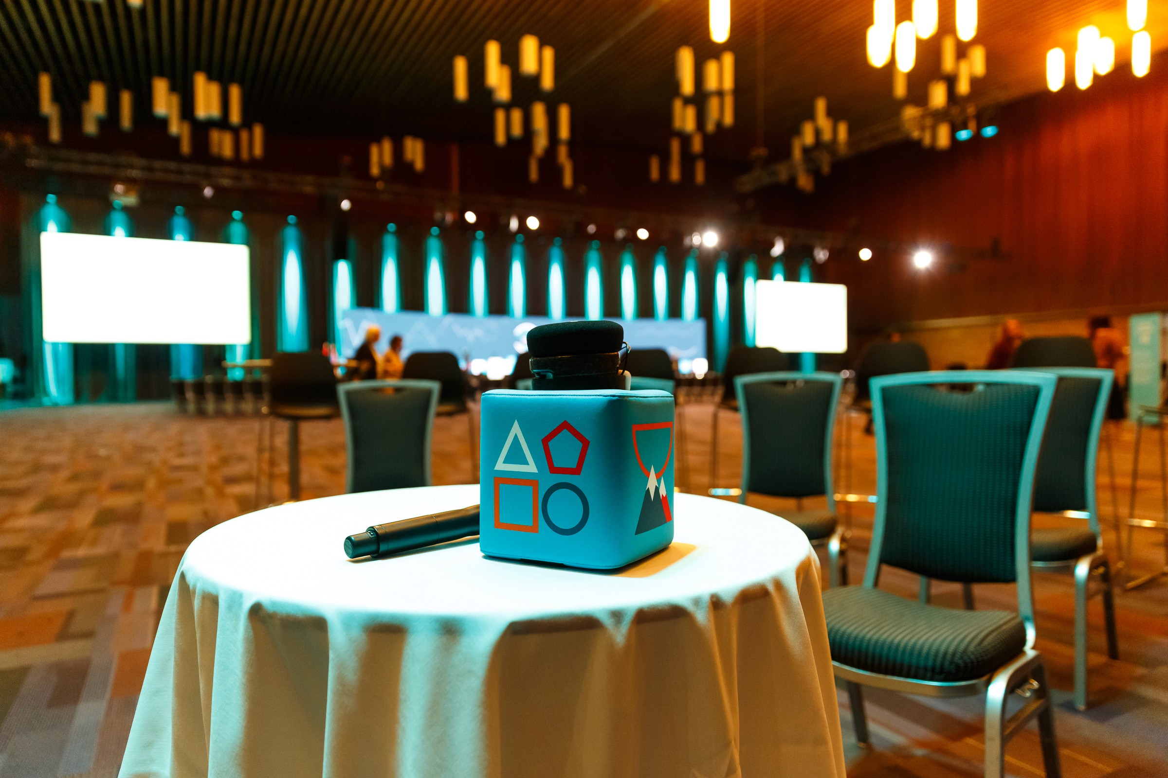
Conference / Events
2018-2021
International Conference Services
Visual Lead / Set Design / Social Media / Ad / Print and Digital



Client
International Conference Services
scope
Conference / Events
year
2018-2021
duration
2.5 years
Overview
The brief.
In events and conferences, atmosphere is everything. From print to web to social, I handled it all, working start to finish with a talented team to create an unforgettable experience.

The Challenge
Creating impact without relying on the usual playbook.
Conference and event branding often leans on borrowed cues, bold stages, big screens, and the same handful of layouts that signal "professional event" without much personality. Those choices work because people expect them. The challenge with this conference was building the same sense of energy and professionalism through a completely different set of visual signals, ones that felt fresh and memorable without feeling chaotic or off brand. Standing out without losing credibility is genuinely difficult to design.
the solution
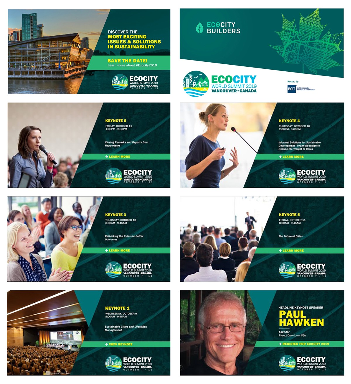
Consistency as the trust signal.
The identity was built around the idea that consistency, visual, spatial, systematic, communicates professionalism more effectively than one off flashy moments. The typeface is a refined grotesque used with exceptional care, every headline tracked and leaded with intention, every layout built on a strict grid that carried across print, signage, and screens. The color palette is reduced to a tight set of core tones, applied the same way everywhere. The mark shows up the same way on a badge, a step and repeat, and a slide deck, no exceptions. The message is implicit: if we're this consistent about how we present ourselves, we're just as consistent about how we run the event.